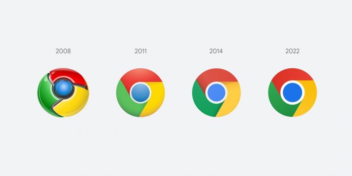
Google is changing the logo for Chrome browser after a long 8 years’ time. It is taking on a simpler look to match the brand image of Google. You might not even notice the changes as they are so subtle. Elvin Hu, a designer for Google Chrome confirmed it on Twitter last week.
Google Chrome is an internet browser from Google. It is very popular and millions of users around the world use it. So, the news is confirmed. Big tech-giant Google has made changes to the logo of the internet browser Google Chrome. Though the changes are minimal and the logo still has the almost same look and feel to the older version. This time it has happened after 8 long years. Google made changes to the Chrome logo last time in 2014. And they will deploy the new icon to the devices worldwide very soon. Google will deploy a big update for Chrome to implement the changes.
The logo still has almost the same general round scheme and four-color design launched in 2009. However, it has brighter colors now. They have increased the size of the circle in middle and removed the shadows as well.
Renovating a logo can be a harsh decision for brands at times. It might irritate customers as they may find it hard to find the apps on the phone’s screen until they get familiar with the new look of the brand logo. For instance, Uber removed U logo and Instagram dropped the skeuomorphic camera and switched to a 2D emblem in 2016. It caused the same kind of issues for users. It will not be the case for Chrome though as the changes made are modest and the logo still looks almost the same.
Elvin Hu, a designer for Google Chrome, shared a piece of news last week on Twitter. He revealed that the logo for the web browser has gone through a change. He also shared the new logo for the browser on Twitter.
What are the changes?
The Google Chrome logo contains red, green, yellow, blue, and white colors. These colors look even more vibrant in the new look. The difference between old and new logo designs is quite subtle. If you compare both the logos then you will find that red, green, and yellow colors have become more lively. The white border of the blue circle seems to be popping out. And the blue color seems to be a bit darker. Also, the red color bar shadow isn’t anymore in the new logo design.
Changes made to the logo aren’t very big. In the words of Google Chrom designer Hu, it will give the product a “Modern Experience”.
Changes made to the Google Chrome logo from 2008 till now, have gradually made it more and more simple. It started as a shiny three-dimensional emblem. Now it has been squeezed down into a 2d sign.
The new logo looks more spirited and eye-catchy compared to the previous version launched in 2014.
Elvin Hu made a tweet on Twitter saying that some of the users might have noticed the changes in Chrome’s icon after Chrome’s Canary update. He confirmed that Google is refreshing Chrome’s brand logo first time in the last 8 years. The icon will soon start to appear across the devices. Further, he mentioned that they have simplified the main brand icon. They have removed shadows, refined the proportions, and brightened the colors. It all has been done to align the logo with Google’s modern brand expression.
He further added that they also found placing shades of green and red next to each other created an unpleasant color vibration. So they introduced a very subtle gradient to the main icon to mitigate this effect making the icon more accessible.
Now, the blue circle in the middle seems to be bigger than earlier after new changes were made. And the colors in the logo appear more lively.
Hu explained on Twitter that they made changes depending on the different operating systems that Chrome runs on. It will have brighter colors without gradients on Chrome OS to match the look and feel of the rest of the system icons. On macOS, it will have a 3D look. And for Beta and Dev, they have applied ribbons to the icons. Clearly, Hu sounds very positive about the change.
New logo deployment date
They started deploying the new logo from 4th Feb’22. It is currently available on the developer version of the browser which is called Chrome Canary. Google will roll out an update for the new logo in the coming months for everyone else. It will not be too long before the world sees the new Chrome logo on the devices.
Why the changes so subtle?
Elvin Hu further explained the reason for the changes being so subtle.
Hu said on Twitter that people might wonder why to bother with something so subtle. Then he explained that they have tailored Chrome’s experience to each OS with features like Native Window Occlusion on Windows, day-one M1 support on macOS, Widgets on iOS/Android, and Material You on Android. It has been done so that the brand conveys the same level of care.
He also requested for feedback to help the team to improve the product in the future.
It is evident that Google is constantly working to make its products user-friendly and updating the Chrome logo is another step in this endeavor. We hope that the users will like the change in logo appearance and will appreciate Google’s efforts to make its products simpler and more accessible.
Stay tuned for more.


