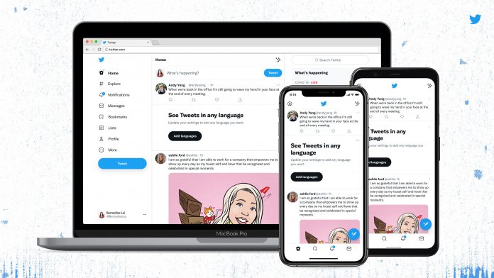
Twitter updated the design of its app and website on Thursday, and it seems that the users are not liking it a lot. Even some of them have stated that the new design is giving them headaches as it is really confusing. And in this update, the follow unfollow buttons are so disturbing for the one it could lead one to mix them up. This update has also launched a new font that is a chip. And the reason behind this design was to amplify the fun and irreverence of the tweet. But it seems that users are not enjoying it and in fact, users are complaining that it is harder to read.
It is understandable that sometimes adapting to some changes is difficult and especially when everything goes smoothly. The same has happened here, these sudden updates of mobile and desktop website layouts were not adaptable by all. According to people, this sudden change was not required. After this change, some people were showing their anger while some people were busy making memes on it.
As soon as Twitter updated the designs and the fonts Twitter said that it may feel awkward at first but it was actually intended to make the website more fun and unique but also at the same time to focus on what users want. One more motive of the sudden change was to provide a clean visual and to introduce more space between the text so that it was clear to read. One of the changes in the design was that Twitter will now align the text of Western languages to the left and this will make it easier for users to read them while scrolling. Nothing is sure about non-Western languages.

Well, Twitter thought that this might be useful for the users and users may love it a lot! But unfortunately, this was not the response that they hoped for. The responses of the users were completely opposite to what they thought. Some users find it really irritating as the sudden change of the design was not understandable at first. And similarly, the new font was not so liked by some users out there. But there were some people who were okay with the changes. Twitter was with all types of tweets regarding this, and people were busy sharing their thoughts too. Have a look at some reactions:
- “Twitter: let’s change the font on everything today.
Us: refreshing our page every second to see if it goes back to the original one”
- “Me opening Twitter and seeing new fonts: lagta hai kisi dusre ki kholi mein aa gaya”
- “Looking for the setting to change the fonts back to the old one”
- “Twitter changed its font. Me who couldn’t discriminate it with the old font: dono alag alag hote hain kya?”
- “No matter what others say I just like the new #TwitterFont”
While some were showing disappointment as the social media platform changed its fonts and the design, not everyone disliked this. Some said they can’t distinguish between them while some said that they are okay with all the changes. We can say that the changes made by the social media platform have received mixed reactions, and the ones who can adapt easily have adapted this already.
Well according to some sources, Twitter is working on fixing the fonts and the design a little bit as windows users are facing some problems. They have also made a tweet regarding it and have said that as people are finding it uncomfortable they are making some changes related to it.


